
A service website can look polished and still lose the right prospects. It can load quickly and still say very little. It can push for conversion and quietly damage trust. The real question is how speed, editorial clarity and the next step work together.
That balance matters even more on technical service offers: AI agents, automation, scraping, local LLMs, prototypes. These topics require trust before action. The website must load quickly, explain clearly, then propose a step that matches the visitor’s level of confidence. That is the core of useful creative web development, not just attractive design.
The website must earn trust before asking for a meeting
Speed opens the door, editorial depth creates trust, the CTA gives a next step. If one is missing, the visitor feels the seam.
The combination that matters
A fast website does not convert if the offer is unclear. Editorial depth does not convert if the reader gets tired. Conversion design does not hold if it feels pushy. The work is keeping the three together.
On every important page, check one thing: can the visitor understand the next step without losing trust?
What makes a service page hold together
A good service website does three things at once: it loads without friction, it speaks with a recognizable voice, and it helps the visitor choose the next step. If one of the three is missing, the website becomes fragile. Performance without a message sells nothing. Style without speed becomes tiring. A CTA without trust forces the hand.
The right question is not “should we optimize conversion?” Of course. The question is: how much proof does the visitor need before we ask for an action?
The triangle to watch
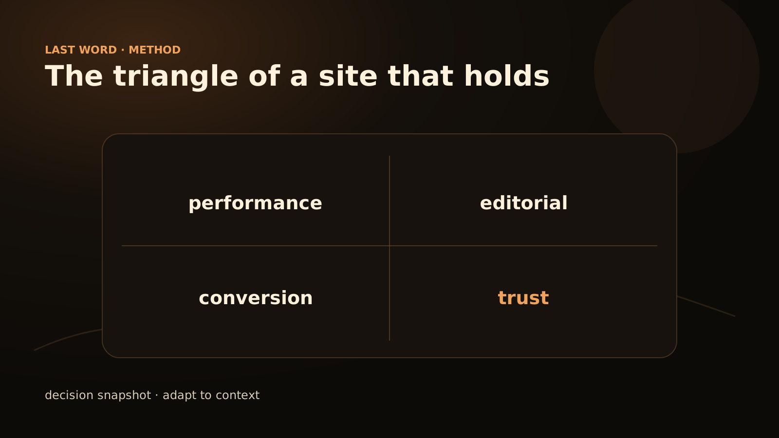
You can think of the site as a triangle. Each side protects the other two.
Performance
What it brings: Less friction, better mobile reading, cleaner crawl If it is neglected: The visitor leaves before understanding
Editorial
What it brings: Clear position, voice, trust, difference If it is neglected: The site looks like every other AI agency
Conversion
What it brings: Readable next step, better-qualified request If it is neglected: The visitor appreciates the site, then disappears
A solid website does not try to maximize one pillar at the expense of the others. It looks for rhythm: fast enough to respect the visitor, editorial enough to be memorable, action-oriented enough not to become a brochure.
Performance: start with real experience
Performance is not only a score. It is the feeling of a visitor on an average phone, with an imperfect connection, trying to understand your offer between two meetings.
The priorities are often basic:
- a readable hero before visual effects;
- compressed and properly sized images;
- few scripts blocking rendering;
- fonts loaded cleanly;
- pages that remain stable when media loads;
- useful content visible even if JavaScript is late.
On an AI website, the temptation is to add animations, assistants, background effects and interactive components. Some can be excellent. But every element must pay rent. If it slows the page without improving the visitor’s decision, it is suspect.
Editorial: say something others do not say
Most AI agency websites look alike because they avoid angles. They promise to transform, automate and innovate. They do not say often enough what they refuse to do, what they monitor, what they do not know yet, or how they choose between a simple tool and a more ambitious system.
A useful editorial voice takes concrete positions:
No autonomy without guardrails
An agent that acts needs logs, permissions, stop thresholds and clear escalation.
No prototype without a testable output
A beautiful demo that cannot be measured is not enough to make a decision.
No local deployment as a principle
A local LLM can help, but it does not replace data governance.
No decorative design
Creativity should clarify the prospect’s choice, not hide a vague offer.
These lines are not there to be provocative. They filter. They help the right prospect understand how you think.
Conversion: ask for less, but ask better
A conversion is not only a click. It is a transition of trust. The CTA must match the visitor’s maturity.
A cold page asking people to “book a call” can work if the need is urgent and the offer is extremely clear. But for a complex topic, the visitor often needs an intermediate step: read a guide, use a calculator, complete a short diagnostic, compare two options.
Discovery
What the site can ask: Read a method, see a grid What to avoid: Mandatory immediate meeting
Problem identified
What the site can ask: Describe the process or ask for an opinion What to avoid: Long form with no clear return
Budget under discussion
What the site can ask: Short diagnostic, scoping, audit What to avoid: Promise of a magical quote
Operational urgency
What the site can ask: Direct contact with context What to avoid: Decorative marketing funnel
The right CTA does not force. It makes the next step obvious.
A page architecture that holds
For a technical or advisory service page, a robust structure often looks like this:
- precise promise in one sentence;
- intro that names the problem, audience and limit;
- three situations where the service is useful;
- working method;
- decision grid or checklist;
- anonymized examples or scenarios;
- risks and guardrails;
- proportionate CTA;
- short FAQ.
This structure works because it respects real reading behavior. The visitor does not read everything in order. They scan, look for a sign of seriousness, return to a section, then decide whether contact is worth their time.
Trust signals to make visible
Trust does not only come from testimonials. It also comes from the way the page handles details.
Simple signals include:
- explaining the limits of a service;
- distinguishing prototype, pilot and production;
- saying when an existing tool is enough;
- showing a decision grid;
- linking to useful supporting articles;
- showing the author and date on editorial content;
- keeping pages fast and readable on mobile;
- avoiding unsourced numerical promises.
For an AI topic, well-written caution is better than excess certainty. The prospect knows the subject is new, changing and sometimes vague. They are looking for someone who can clarify it without acting like a magician.
The quick audit method
Before a redesign or optimization project, take five important pages: homepage, services, one article, contact, one offer page. Score each page from 0 to 2 on the following criteria.
Perceived loading
0: Slow or unstable 1: Acceptable but heavy 2: Fast and stable
Message
0: Vague 1: Understandable 2: Specific and distinctive
Proof
0: Absent 1: Present but light 2: Clear method, example or tool
CTA
0: Confusing 1: Visible 2: Aligned with intent
Mobile
0: Difficult 1: Acceptable 2: Comfortable reading
Difference
0: Generic 1: Some angles 2: Clear, confident voice
The score does not replace a full audit. It shows where to act first. If the page is slow and vague, do not start by changing the button color. If the message is strong but the CTA is missing, do not rewrite everything. Add a logical next step.
SEO and answer engines
A fast, well-structured website is also easier for search engines and answer assistants to understand. Definitions, tables and checklists create reusable reference points, as long as the content remains clear and verifiable. Internal links help connect clusters: AI agent, automation, local AI, scraping, web development.
But the content must remain readable in HTML. If all the value sits inside an opaque component, animation or client-only module, it may be less understood. The page should carry its reasoning in the text, headings, tables and examples.
Where to put effort first
If the website already exists, start with the page that combines high business value with a visible clarity gap. Not necessarily the prettiest one to redesign.
Pragmatic order:
- clarify the promise;
- remove clichés;
- add a useful grid or checklist;
- check loading time and images;
- make the CTA more natural;
- connect the page to articles that explain the topic;
- only then add interaction or animation.
This is not glamorous. It is often where the gain sits.
A one-pass reading diagnosis
- Before the scroll: is the offer and audience clear?
- Middle of the page: is there a method, not only benefits?
- Proof: are limits and concrete signals visible?
- Next step: does the CTA ask for the right level of commitment?
FAQ
Do you have to choose between creative design and performance?
No. You have to choose effects that truly serve the journey. A strong visual direction can remain light if media, scripts and fonts are controlled.
Does a very editorial page convert less?
Not necessarily. For a complex offer, editorial depth can increase trust and qualify requests. The key is to keep CTAs visible and natural.
What metric should come first?
For a service website, first track whether incoming requests better match the projects you actually want, then analyze the journeys that lead to them. Technical scores help, but they are not enough to judge commercial value.
Why mention GEO on a service page?
Because answer engines are more likely to cite pages that provide clear definitions, criteria and methods. A vague page has little chance of being reused, even if it is well designed.
Read next
To extend the topic, see how an AI landing page avoids clichés and why creative AI websites should help people decide, not only impress them.