An AI-enhanced website should not begin with an impressive animation. It should begin with a simpler question: what can the visitor understand, compare or decide more easily because AI is present?
If the AI only moves shapes around, generates vague copy or signals “modernity”, it adds noise. The valuable version shows up in the journey: a clearer diagnosis, a faster selection, a transparent simulation, a personalised explanation, or a tool the prospect can reuse in their own context. That is where creative web development becomes more valuable when it connects with process automation and rapid prototyping.
AI creativity should make the visitor’s choice clearer
A creative website can surprise people. But if it does not make the decision easier, it is a demo for the team, not a tool for the prospect.
The sorting rule
AI on a creative website should support a decision, not just produce an effect. An animation, generator or agentic interface becomes useful when it clarifies an offer, shows a method or helps the buyer phrase their need.
If the effect changes neither understanding nor next action, remove it or turn it into simpler proof.
Usefulness before the wow effect
AI is useful on a website when it reduces the visitor’s effort without hiding the rules of the game. It can help someone choose an offer, prepare a brief, filter options, estimate an order of magnitude or turn dense content into a readable decision. It becomes decorative when it does not improve understanding, trust or the next action.
The simplest test is this: if you remove the AI, does the page lose a decision tool or only a visual effect? If it loses a tool, there may be a real use case. If it only loses an effect, put the energy back into speed, positioning, proof and calls to action.
The decision-value matrix
Before building an ambitious interface, score the idea against a few practical criteria. This is not a mathematical score. It is a way to avoid expensive gimmicks.
Offer selector
Helps the visitor?: Yes, if the rules are clear Main risk: Recommendation too vague Better format: Short questionnaire + explainable result
Brief generator
Helps the visitor?: Yes, if the output is usable Main risk: Asking for too much information Better format: Progressive form + text export
Conversational demo
Helps the visitor?: Sometimes Main risk: Generic answers, cost, hallucination Better format: Framed demo with controlled examples
Content personalisation
Helps the visitor?: Yes, for known segments Main risk: Pointless over-segmentation Better format: Simple conditional blocks
Generative animation
Helps the visitor?: Rarely on its own Main risk: Showcase effect with no business value Better format: Keep it light and secondary
Calculator
Helps the visitor?: Often Main risk: Hidden assumptions Better format: Visible formula + explicit limits
The pattern is clear: the page should produce something usable. A beautiful page that leaves no useful trace in the prospect’s mind is still just a beautiful page. For a complex purchase, that is not enough.
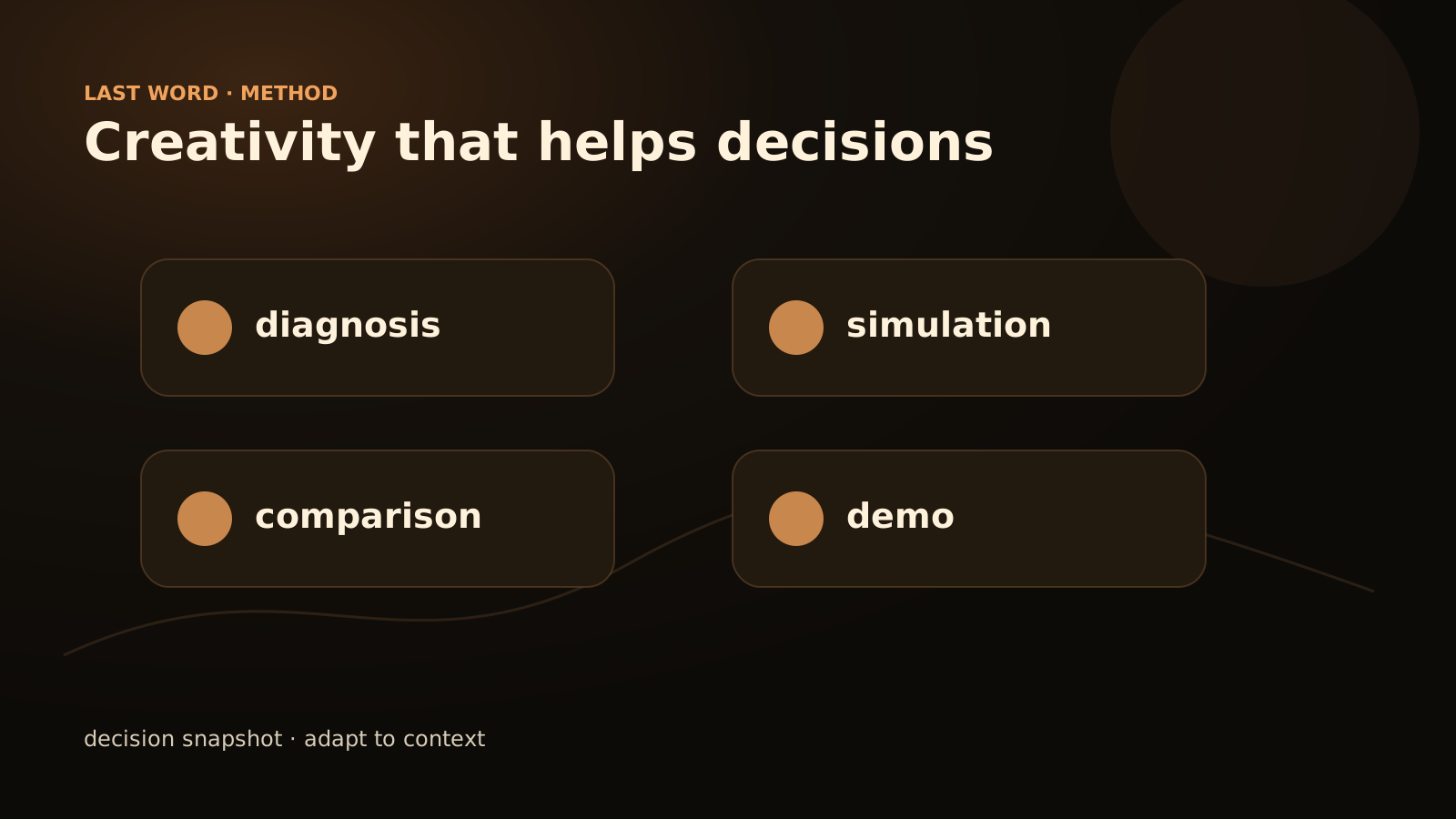
Start with a real decision
The right starting point is not “let’s put AI on the page”. It is a decision the visitor needs to make.
For a small or mid-sized business looking for an AI partner, those decisions often look like this:
- Is my problem an AI agent use case, a classic automation problem or simply a process issue?
- Are my data and documents clean enough to test something without losing three weeks?
- Should I build a prototype, buy a tool, or do nothing for now?
- What level of human validation should remain in place?
- What maintenance budget should I expect after the first version?
An AI interaction helps if it makes those trade-offs more concrete. It can ask three questions, restate the context, suggest a framing path and propose a next step. But it must stay honest: it does not know the company, it does not replace a diagnosis, and it must not invent a promise.
Three formats that beat a generic chatbot
A general-purpose chatbot is rarely the best first choice. It is expensive to frame, hard to control and often less useful than a small, well-designed tool.
The use-case selector
The visitor answers a few questions. The site suggests a direction: automation, business agent, scraping, local LLM or creative website. The result explains why.
The transparent calculator
The page shows its assumptions. The visitor changes variables and sees when the project becomes interesting, or when it does not.
The brief generator
The site helps the prospect describe the need in a readable format. They leave with a summary, and the team receives cleaner context.
These formats are less spectacular than an open conversation. They are also more reliable. They create an output the visitor can reread, challenge and send to someone else.
Make the rules visible
An AI website loses trust quickly when it behaves like a black box. The limits should be visible, not just the benefits.
A good page states:
- what data is requested and why;
- what the tool cannot do;
- which assumptions are used for calculation or recommendation;
- the expected level of precision;
- the next human step;
- how to correct a bad answer.
This does not have to make the design heavy. It can be a short note, a “how to read this result” section, or a well-written empty state. Visitors do not need a technical essay. They need to know whether they can trust the tool.
The right level of creativity
Creativity matters. A Last Word website should not look like a generic SaaS landing page. But the art direction should strengthen the message, not hide it.
For AI websites, restrained creativity often works better: strong typography, editorial rhythm, useful micro-interactions, visuals that explain a method, mobile-readable tables and modules that turn a vague subject into a concrete choice. AI can be present in the experience, but it should not become the main character.
The classic trap is a page that screams “future” while leaving the visitor alone with their problem. The better site does the opposite: it may look calm, almost simple, but it genuinely helps the visitor move forward.
A checklist before building
Before production starts, ask these questions. If several answers are vague, the idea is not ready.
| Question | Why it matters | Possible decision |
|---|---|---|
| What decision must the visitor make? | Without a decision, AI becomes decoration | Reframe the module around a choice |
| What data is necessary? | The less you ask, the more likely the tool is used | Remove unnecessary fields |
| What output does the visitor keep? | A reusable output increases value | Generate a brief, matrix or explained score |
| What error would be damaging? | A bad recommendation can harm trust | Add limits, validation or demo mode |
| What can Google see without JavaScript? | Useful content must remain crawlable | Provide text, table or static fallback |
| Which CTA follows naturally? | The tool should open a logical next step | Contact, audit, service page or related resource |
This checklist is also a useful technical brief.
SEO and GEO: the tool must be crawlable
An AI module can support search visibility if the page also contains value that can be read without interaction. Search engines and answer engines should not have to guess what the tool does. The page must explain the problem, criteria, limits, steps and possible results.
To be cited, a page needs reusable value: a decision grid, a formula, a method, a clear comparison. A simple interactive effect is not enough. The static version of the tool should therefore exist in the body of the page: table, example, process, diagnostic questions.
This is especially important for creative websites. The visual effect can seduce a human, but the editorial structure helps the page be understood, shared and cited.
When not to use AI
There are cases where AI adds nothing to the site. If the content is stable, the choice is simple, the data is sensitive without a clear framework, or the team cannot maintain the module, do not add it.
You can often get a better result with a faster page, a sharper headline, a decision table, a concrete example and a clean form. AI has to earn its place. It is not an obligation of modernity.
How Last Word would frame the project
Start with a short workshop: target journey, visitor decision, requested data, expected output, risks and CTA. Only then choose the format. Sometimes it will be a calculator. Sometimes a brief generator. Sometimes a very clear editorial page with no visible AI at all.
The useful deliverable is not “a website with AI”. It is a page that turns hesitation into a reasonable next action. If you want to frame that kind of module without building a machine for its own sake, start with web development or describe the need.
When AI deserves a place in the interface
- Decision: it helps the visitor choose, compare or formulate.
- Transparency: the rule remains understandable without magic.
- Data: what is requested is proportional to the value returned.
- Output: the result leads to a clear action.
FAQ
Does an AI website need a chatbot?
No. A selector, calculator or brief generator can be more useful, more reliable and easier to maintain than a generic chatbot.
Does AI automatically improve conversion?
No. It can help if it removes a real hesitation. If it only adds novelty, it may distract the visitor.
How do you make an AI module SEO-friendly?
Keep a crawlable version of the value: explanation, grid, example, table, questions and limits. The module can enrich the experience, but it should not be the only place where the information exists.
What should be prototyped first?
Prototype the output, not the full interface. If the recommendation, brief or score does not help the visitor, design will not save the module.